
January 2021 - March 2021, Shipped Project
Develop For Good
Develop for Good is a nonprofit organization that works with students and mentors from Universities like Harvard, Stanford, UC Berkley and more. They pair students in teams with small to large nonprofit organizations to redesign their website to help with traffic and their user’s experience.

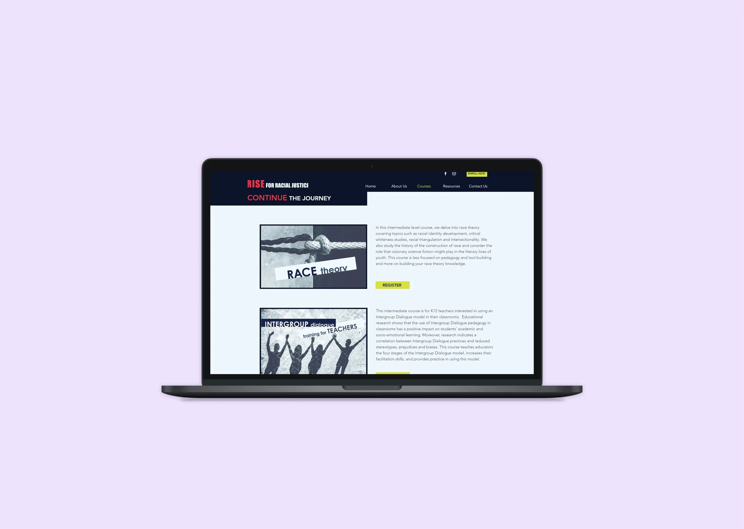
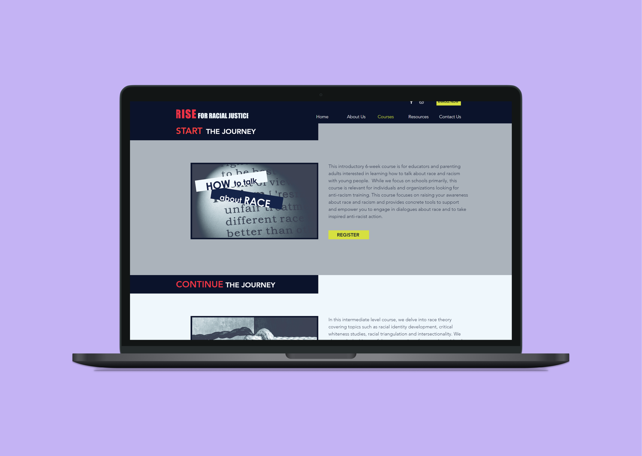
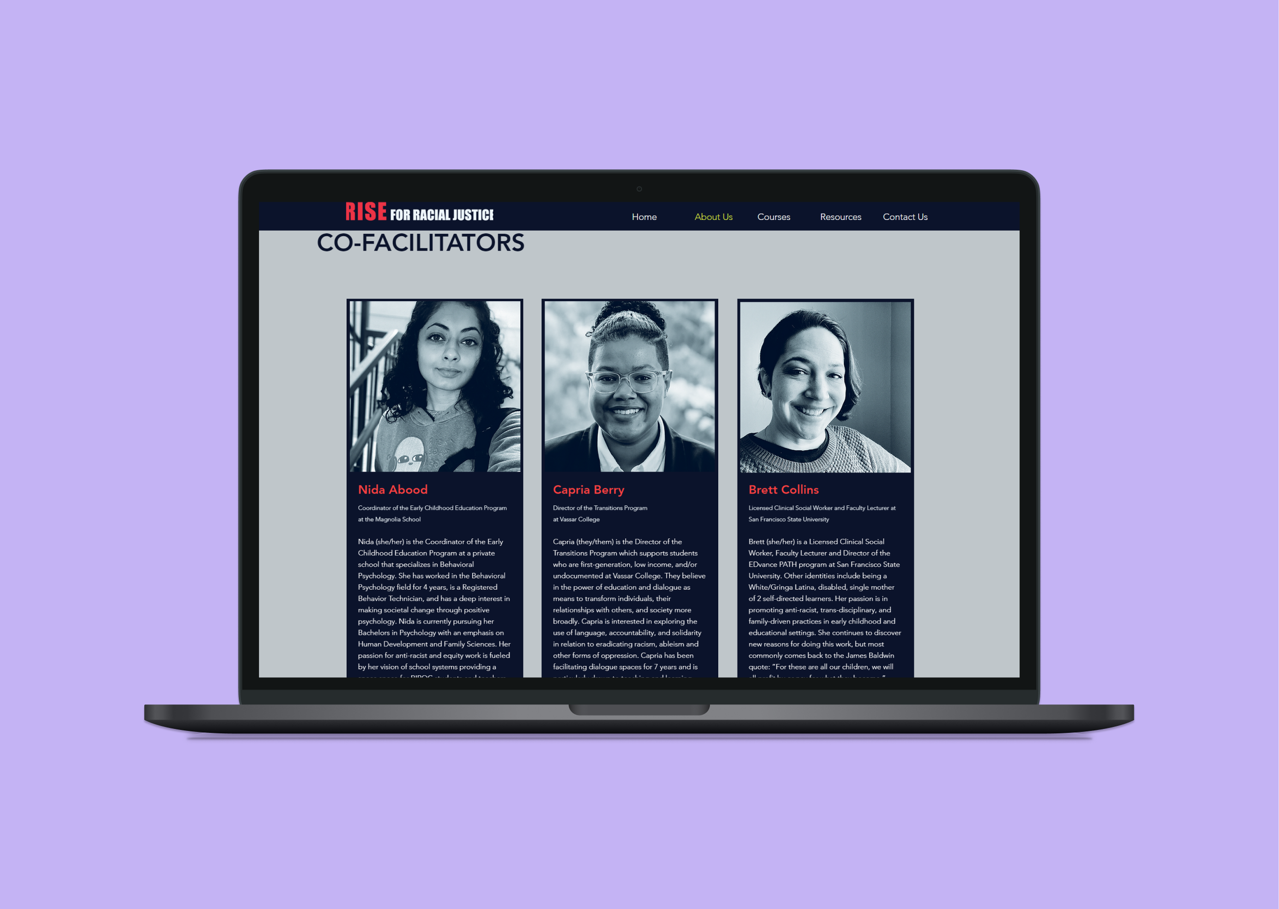
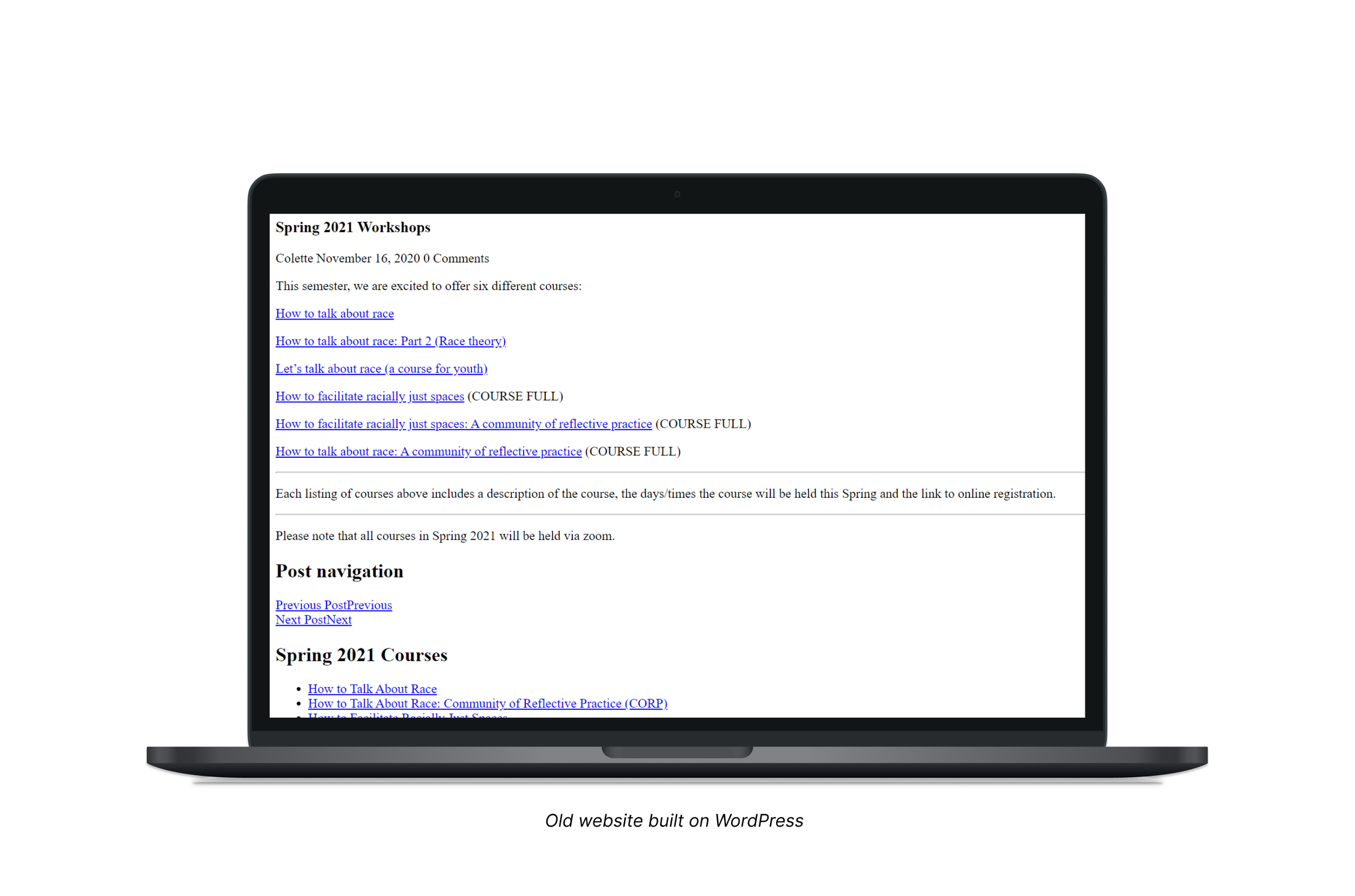
During my time as a seasonal intern at Develop for Good, my team and I were partnered with a nonprofit organization called Rise Center For Racial Justice based in Oakland, CA. I was able to work closely with the people who pioneered for this NPO to be where it is today and managed an array of responsibilities. Rise Center For Racial Justice provides classes on how to talk about race, how to act with anti-racism, and try to create a safe space for people to be conscious. The website was built with WordPress and was extremely outdated. There were inconsistent funnels to sign up for classes, lack of information on which classes were more advance than others, and they lacked brand identity. They had a clear mission in mind, but it wasn’t being communicated well enough. My task was not only to redesign their website for a clearer experience, but also define their mission statement to strengthen the relationship between potential students and Rise Center For Racial Justice.

Original Rise Center For Racial Justice Logo
Goals
Going into this project, I researched my client and nonprofit organizations to understand general goals to keep in mind while starting my design process. For example, the accessibility and usability of a website can affect the trust the user has with the organizations credibility. The organizations credibility was crucial here because Rise For Racial Justice provides classes to teach others on subjects that have history.
I took the lead design role for my team as I had the most experience using Figma during the time. To lead my team to success, I studied product development processes and collaborative working with other designers. With my team, I conducted a series of user interviews and surveys that asked questions about their familiarity with anti-racism and the of the usability of the site.

We shared our surveys across all our social media platforms and collected over 50 responses. Our research involved making surveys, creating affinity maps, and user profiles. The survey was shared through Google Survey, and it included: Questions about the usability of RFRJ’s website, what emotions the user felt while using the site, and what they thought about sign up process.
The questions asked:
What do you think of this sites navigation?
What motivates you to learn about race?
What would you like to see more on Rise’s Website?
Did you understand their mission statement?
Do you typically learn about racial justice through: Social media, news, books, or peers/word of mouth?
We asked our users to go through the course registration process that Rise Center For Racial Justice already had in place. There was a lot of drop off on the page as it was too complicated for users to use, this indicated that there are problems with the information architecture.

With our insights from the affinity map, interviews, and surveys - my team and I created user profiles. This created a more solid framework on our product goals helping us identify user need and audience behavior. With our target audience identified, we began designing. I was responsible for creating the information architecture and initial wireframes. I constructed wireframes based off of user responses in juxtaposition to the expectations of Rise for Racial Justice.
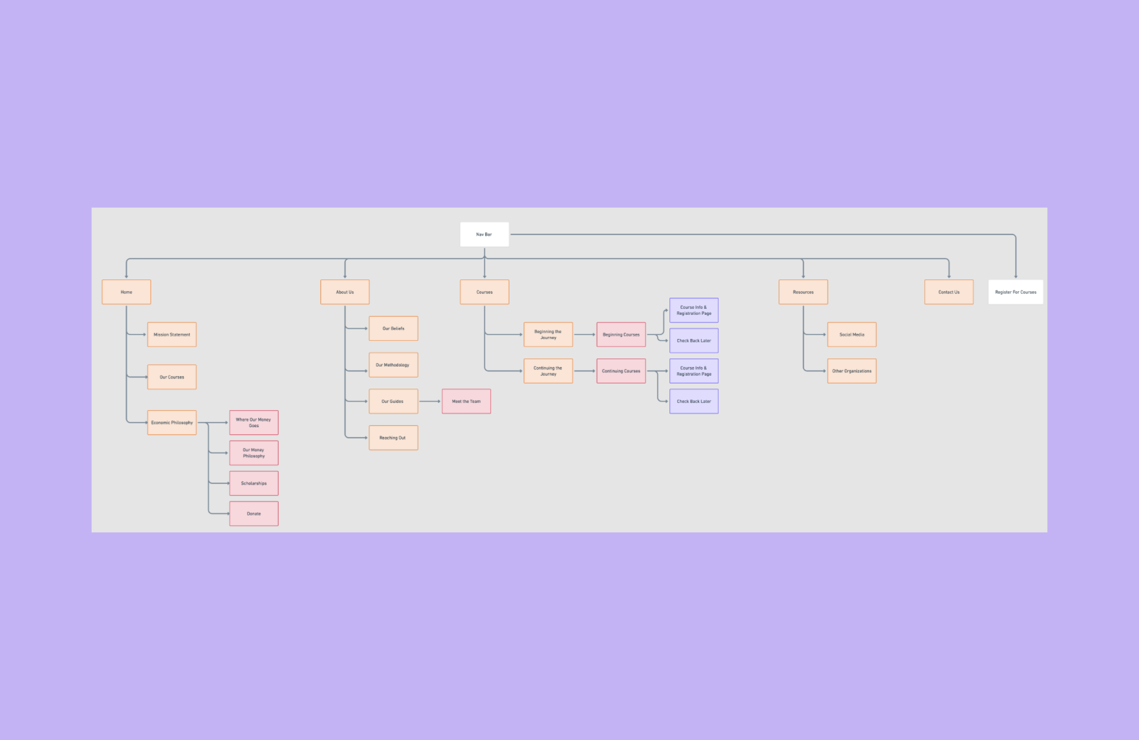
During the initial stage of wireframing, I focused on a new information hierarchy based off the responses from user testing. Users found it complicated to schedule an appointment, there were inconsistent funnels that lead to users giving up on performing certain actions. Prior to my team helping, there was no in house designer at this organization so there was a lot of ambiguity surrounding goals, target audience, and brand identity.
Wireframing

Mapped out the initial structure of the website, focusing on the flow of the website.

Second iteration

Third iteration

With no in house developer or designer, there was a lack of computer literacy in the organization. It made the most sense to use Wix as the website builder that was the most in budget and similar to WordPress. By using a website builder, our client would be able to sustain and continue to build on the designs even after the internship program ended.
My client was very particular and specific about the images used for the redesign. The images were to reflect the welcoming, powerful, and united community that Rise Center For Racial Justice has built along the years. The colors were also very specific to the clients request. The stark contrasts were to represent confidence.


I took it upon myself to create a style guide for Rise Center For Racial Justice. I wanted the organization to have documentation of the typography, hierarchy, and colors used across the new site. This documentation will help the organization with any future adjustments made on the website to be consistent throughout.


