June 2021 — September 2021, Shipped Feature
RepairPal
RepairPal is a two-sided marketplace in the auto repair industry and offers a two-sided service to car owners and auto repair shops. They offer both B2B and B2C products, and I had the opportunity to work on both sides. For this project, I worked on the B2C side and focused on the RepairPal site itself, which would primarily involve interacting with car owners. I conducted competitive analysis, crafted general user flows, and created an affinity map. I also contributed in the redesign for this project — defining a user forum and crafting empty states.
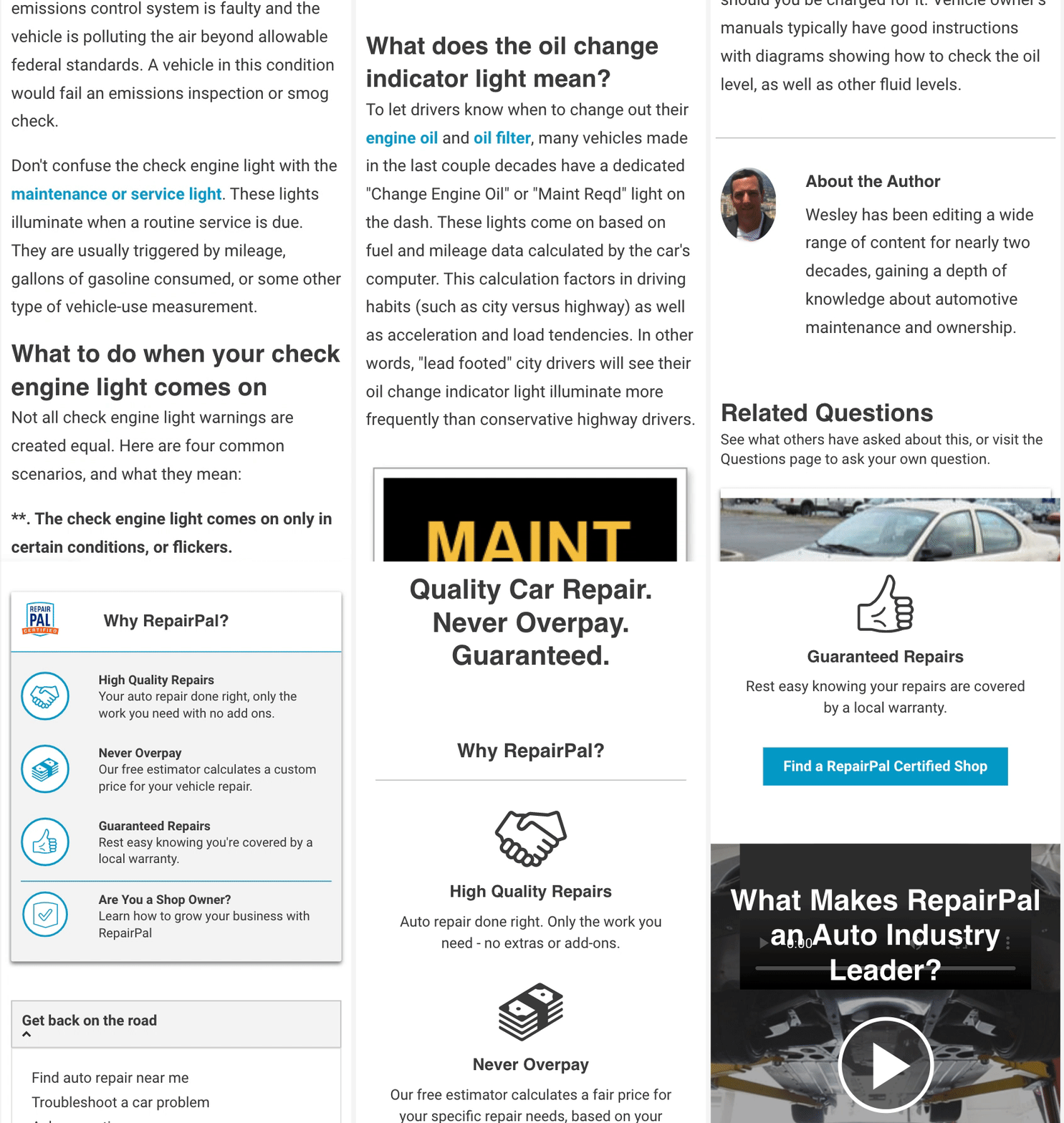
Old symptom’s page design
Why redesign?
Currently, the Symptoms page is fragmented and buggy. Links to key conversion elements are difficult to access and many users may “get lost” or fail to perform certain actions. User Interaction such as troubleshooting quizzes on the Symptom’s landing page, fail to offer the user an enhanced experience on the page than expected. The Symptom’s page is highly traffic-ed with low conversion rates. We hope that with the redesign we can make the page predictable, accessible, and overall easier to use for the consumer.
What is the user problem?
Users are unable to find what they’re looking for. Based on user research, we can see users are not completing certain actions. Users that were taking the “troubleshooting quiz”, a quiz to help users diagnose their symptoms, almost always abandoned it mid-way! This behavior could be due to a variety of factors, including cognitive overload and distractions. With the quiz being on a blog article page and having additional content below it rather than being a stand-alone experience, there is a higher chance that users will not complete the quiz due to the competing content options.
Scrolling and switching pages
Users abandoning troubleshooting quizes
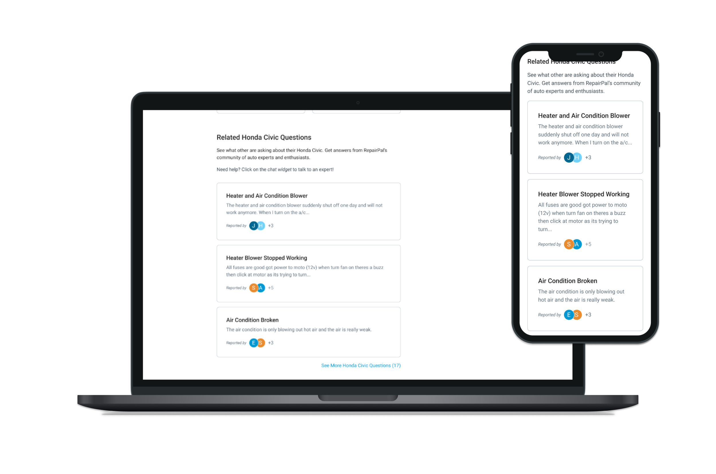
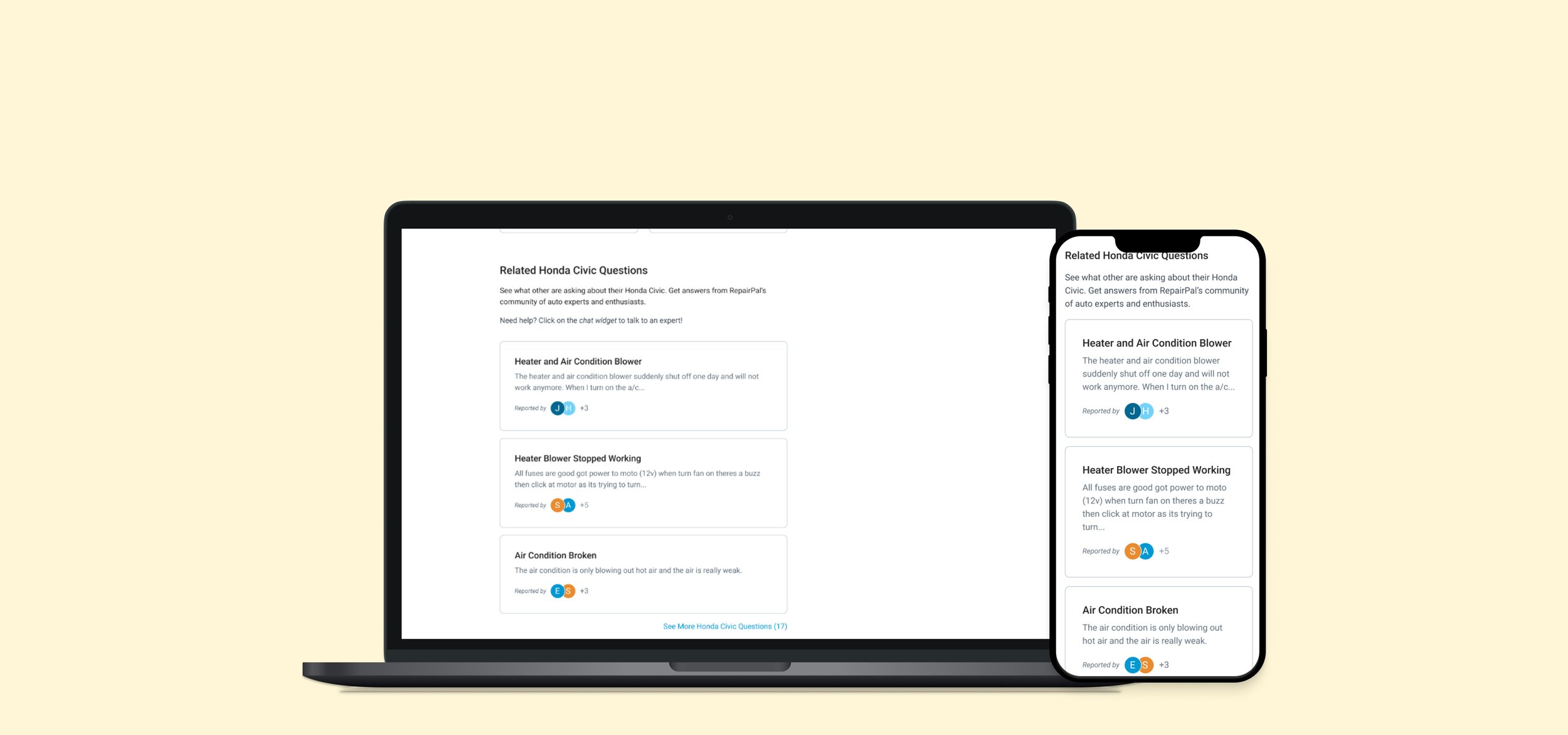
"Related Questions” redesigned by Eunice Jung
Goals
The primary goal of this redesign is to offer users more easily accessible information regarding their symptom and show repair costs sourced from national estimates. A key assumption is that users may be more likely to convert (or have a better experience in general) if they are presented with cost estimates regarding their symptoms.
Armed with more information about their Symptom, a user will be more likely to find what is wrong with their car and make a decision.
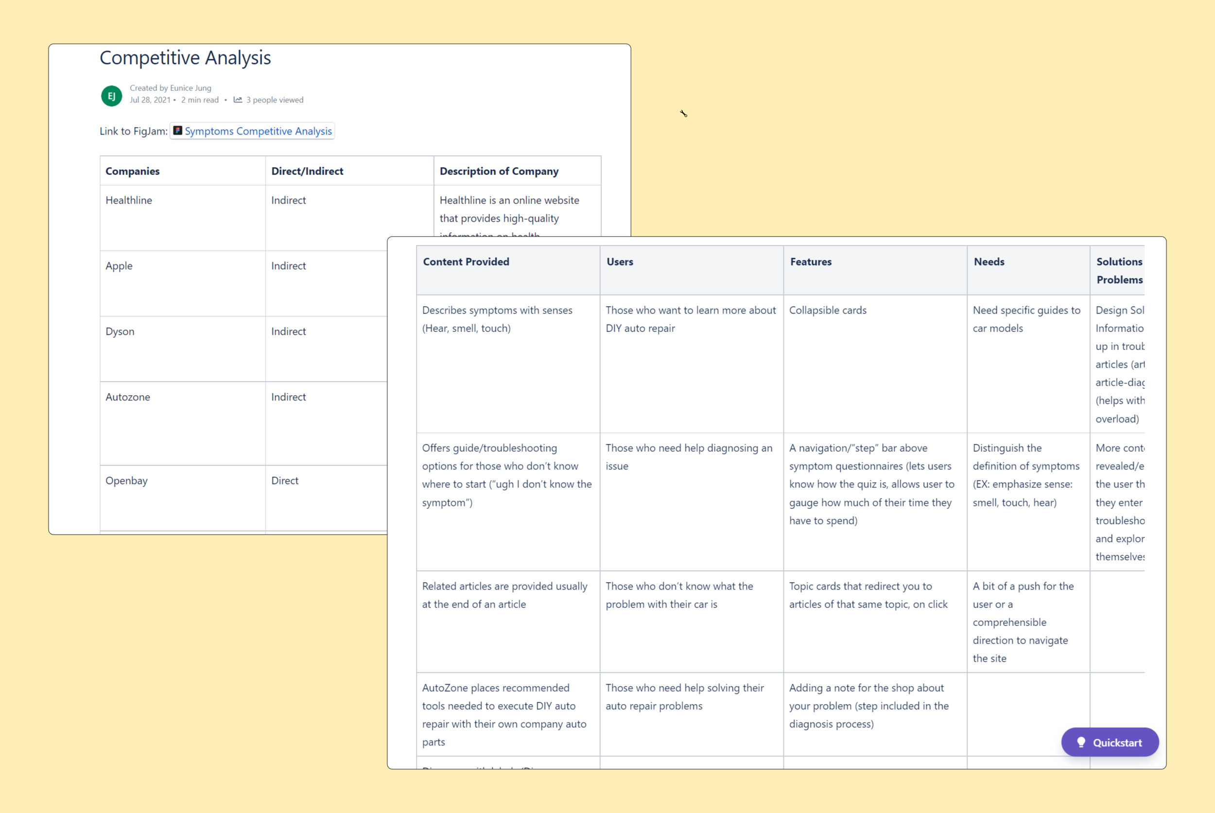
Competitive Analysis
I looked at both indirect and direct competitors. I studied their troubleshooting process -looking for any pain points or even potential solutions that could benefit our troubleshooting process. I looked at eight different companies and answered these questions to help get a better understanding of their product and how its used:
What problem is this troubleshooting or support experience trying to solve?
What are the steps in the user flow?
How does the design actually “solve” the intended problem?
What kind of content is being provided to users? How is it organized?
Confluence page
Design
I was tasked to redesign the “Related Questions” section of the Make Model Symptoms page. The problem was that the current implementation of “Related Question” looks identical to the “Related Problems”. This component is not differentiated in any way from the Problems component, even though they offer vastly different types of information. This can cause confusion for users, mislead users, and did not convey to the user that these were use posted questions.
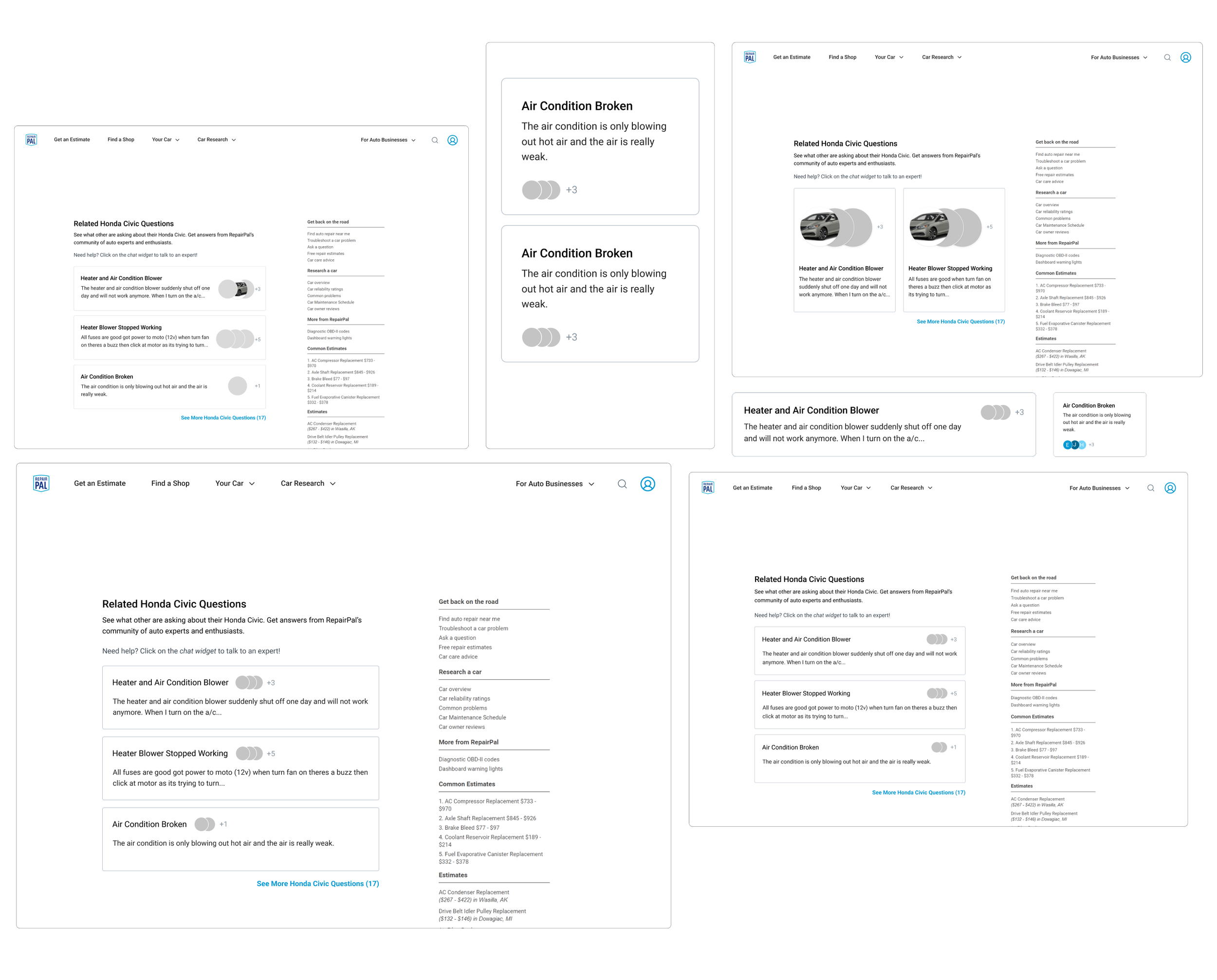
When I first began my design process, I studied different user forums sites. I went to live sites to study the user flow and functionality of components similar to user posted questions. I looked at sites like Reddit, Airbnb, YouTube and more. After I studied other sites I began my first iteration of Symptom’s “Related Questions”.
Current implementation of “Related Problems”
Current implementation of “Relation Questions”
Wireframes
Before and after the redesign
Additional Contributions
I also contributed to designing the empty states for Repairpal’s Directory Widget. The widget allows users to find a shop without going to the Directory page directly. I designed the empty states for the Directory Widget for when it cannot find a shop near a user and cannot locate the user. I learned how to write UX copy to funnel the user back into our product, and any other support resources we may have. This is important because we want to design for each use case and do not want to leave the user hanging if the system cannot complete the action.
Error State


